Vaxholms Hotell in Black and White: Working With Hard Midday Sun
Summer, sun almost overhead, shadows short and hard. This is the light every guide tells you to avoid, and it’s also the light you get if you’re standing in a Swedish archipelago town at one in the afternoon with a ferry to catch. So you work with it.
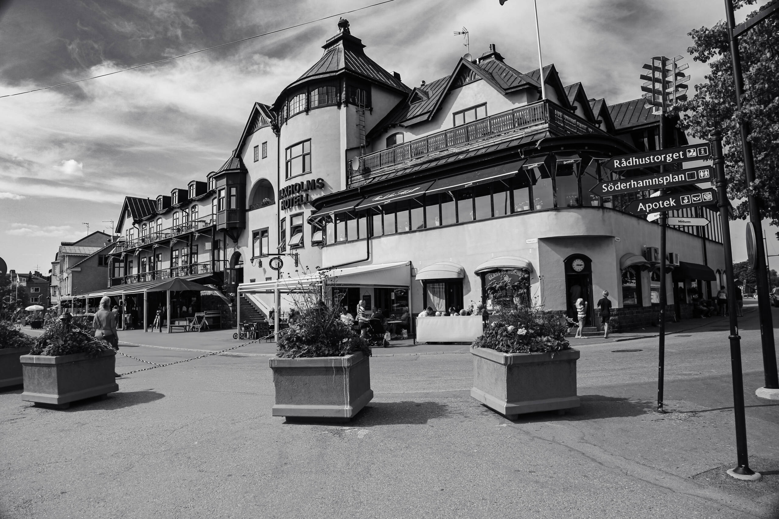
The colour version of this frame would be pale render, a red-brown roof, blue sky. Pleasant and completely forgettable. Nothing in the scene depends on hue. What it depends on is the roofline, the tower, the seamed metal, the black glazing bars against white walls. All of that is tonal, which is the test for whether a frame should go monochrome. Take the colour away in your head first. If the picture still holds, convert. If the picture was the colour, leave it alone.
The sky does the work
Hard sun means a deep blue sky, and deep blue is where black and white conversion earns its money. Pull the blue channel down and the cumulus edges separate out against a mid-grey field. That’s most of the drama in the upper half here.
Two cautions. Pull too far and the sky goes near-black, which reads as fake unless you’re deliberately going for a heavy print look. And watch the corners. There’s an overhead wire crossing the top left of this frame that vanishes in colour and turns into a hard graphic line the moment you convert.
Corner-on, low, wide
A building like this has two faces and a tower at the hinge. Shooting it flat-on from across the square would flatten it into a facade. Standing at the corner gives both elevations, and going wide from low pushes the tower up and lets the roofline run diagonally out of frame to the right.
That’s the right instinct. The execution has a cost.
What the planters gained and what they cost
Three concrete planters in a receding line, near to far, left to right. They do real work: depth, scale, a rhythm across the bottom third that stops the asphalt from being dead space.
They also sit directly in front of the terrace, which is where the people are. Diners at the tables, the pram, the kids by the ice cream window. That’s the life of the picture and the middle planter covers a chunk of it. A step to the left, or dropping another thirty centimetres, would have kept the rhythm and opened the sightline. Worth noticing for next time.
Same story on the right edge. The lamppost is hard against the frame, and there’s a signpost arm and a bare flagpole competing for attention. In colour these recede into the general street furniture. In monochrome they become shapes, and shapes get looked at. Either commit to the lamppost as a framing element and give it space, or move until it’s gone.
Exposure and finishing
Expose for the white render. It’s the biggest bright surface and the first thing to clip. Nordic summer light has a lot of open sky bouncing around, so the shadows under the awnings come back up easily with a mid-tone lift.
Don’t push the contrast to full noir. The appeal of this building is fussy detail, dormers, balcony railings, the little clock over the corner door. Heavy blacks swallow all of it.
One last thing worth keeping. The direction signs stayed in frame, legible: Rådhustorget, Söderhamnsplan, Apotek. Three words and the viewer knows what country they’re in.
No caption needed.