Night Street Poster Turns Shop Light Into Amber and Indigo
Amber light spreads across the stone facade, catches a white T-shirt and falls in sharp diagonal bands over the pavement. Between those bright areas, indigo gathers beneath arches, around doorways and across the faces of people walking toward us. The street is busy, yet the poster has a surprisingly firm structure. Its strongest shapes belong to the building and its shadows; the passing figures keep that structure from becoming too tidy.
The photograph behind this image already had a good arrangement of light. A row of shops receded along an old stone street, with hanging clothes illuminated above a crowd and much of the foreground slipping into darkness. Posterization brings those relationships forward. The wall becomes a broad field of gold, the night becomes blue, and small details survive where they help the eye move through the picture. You can still read the scene as an evening walk. From farther away, you read an arrangement of warm and cool shapes.
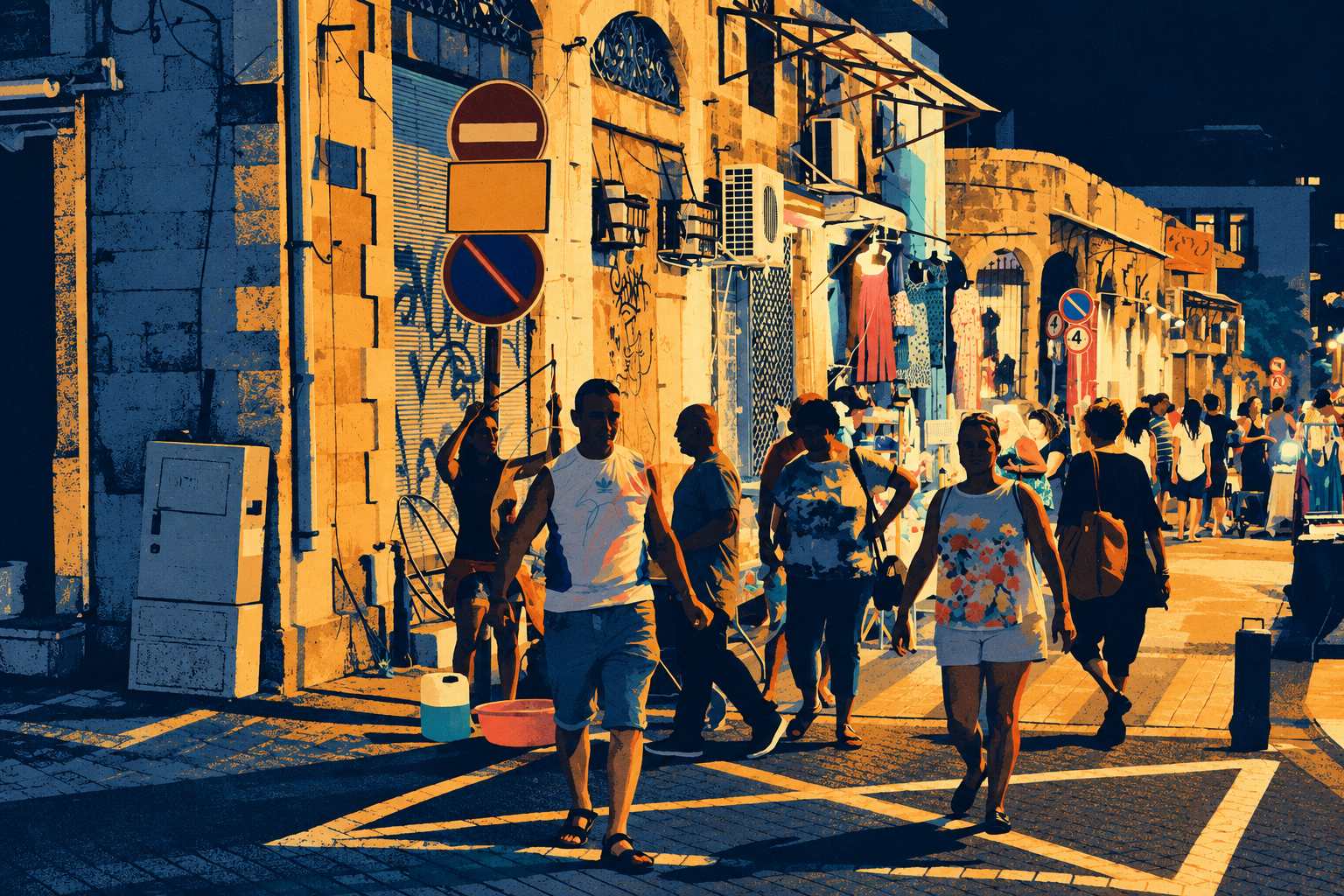
Image hosted by MediaInstances.com.
At the left, a cool blue wall establishes a heavy vertical edge. Pipes and blocks remain visible through the grain, while a pale utility cabinet sits close to the ground like a small, stubborn rectangle. Beside it, the yellow facade carries a stack of traffic signs. A red no-entry disc sits above a blank amber panel, with another dark circular sign below. These everyday objects have become a compact piece of graphic design inside the larger image. Circles interrupt the straight lines of shutters and masonry, and their muted red gives the gold somewhere else to go.
Higher up, the building becomes more complicated. Arched openings, grilles and air-conditioning units crowd the surface. The metal frame of an awning reaches across the top in a web of narrow diagonals. There is no attempt to turn this into an immaculate old town. The equipment stays, as do the graffiti and exposed fittings. That matters to the atmosphere. The street feels occupied and used, with practical additions layered over its stonework. Cleaning all of that away would leave a much less interesting wall.
The shop display near the center supplies the brightest small accents. A coral dress hangs beneath a cream lamp, beside patterned blue and pale garments. Below them, scattered patches of turquoise and warm white suggest merchandise without asking us to identify every item. The dresses also repeat the long shapes of the pedestrians beneath them. Clothing hangs still above the pavement while clothing moves through the foreground. It is a quiet visual rhyme, easy to miss on the first look.
The people carry most of the picture’s movement. A man in a pale sleeveless shirt advances near the left of center, his body divided into cool blue and warm cream patches. To his right, a dark-haired figure stands with an arm bent outward, creating a strong triangular gap. A woman in a patterned top and light shorts approaches on the right, while another figure with a shoulder bag moves away behind her. Their faces are simplified, sometimes almost swallowed by blue. Posture does the work. You understand who is walking, pausing or turning without needing a portrait of each person.
Across the bottom, the pavement becomes unusually assertive. Pale road markings cut through long shadows and make angular enclosures around the feet. Those bands pull the foreground together, preventing the pedestrians from floating as separate silhouettes. Farther back, the figures shrink and cluster beneath a line of shop lights. The image keeps its depth even though its colors sit in flat, abrupt areas. That tension gives it much of its energy: a street receding into space, built from shapes that keep declaring the surface.
The fine speckling helps the large blue and gold passages feel less sealed off. It suggests ink catching unevenly on paper, although the artwork here is a digital image with a print-like surface. There is enough texture to soften the edges without losing the graphic clarity. Too much grain would make the architecture noisy; perfectly smooth fills would make the scene feel oddly weightless. Here the roughness suits the shutters, stone and scuffed pavement.
For display, the horizontal composition deserves room to breathe. A narrow dark frame would echo the indigo passages, and a modest pale margin would keep the gold from running directly into the surrounding wall. The image already contains a crowd, shop fittings and several competing directions, so elaborate framing would add very little. Its strongest quality is the way it holds all that ordinary street clutter together. The lights stay on, people keep passing, and the blue between them gives the evening its shape.