Soviet Constructivist Posters and the Birth of the Modern Ad Layout
Scroll past any sneaker drop, any streaming launch, any festival line-up on your phone and you’ll see the same moves. A cut-out photo set at an angle. One loud color on black. A headline so big it stops being text and turns into a shape. A slogan bent around the product like a fence. Nobody designing those tiles is thinking about Moscow in 1923, and they don’t have to. The grammar was settled there, by a handful of artists who were told to sell biscuits, galoshes and books to a country that had just been through a revolution and a civil war.
The odd part is the commission. Under Lenin’s New Economic Policy, state enterprises had to compete in an open market again, and competing meant advertising. So the avant-garde, people who had spent the war years painting black squares and arguing about the death of easel art, went to work for shops. What they built for those shops is still the template for how a commercial page is laid out.
Start with the most famous image of the lot, which isn’t an ad at all. El Lissitzky’s Beat the Whites with the Red Wedge is a 1919 lithograph from the Civil War: a red triangle driving into a white circle, a few words of type tilted to follow the thrust. There’s no figure, no flag, no soldier. Two shapes and a direction do all the work. That’s the first lesson every later ad designer took, whether they knew the source or not; the composition carries the message before anyone reads a word.
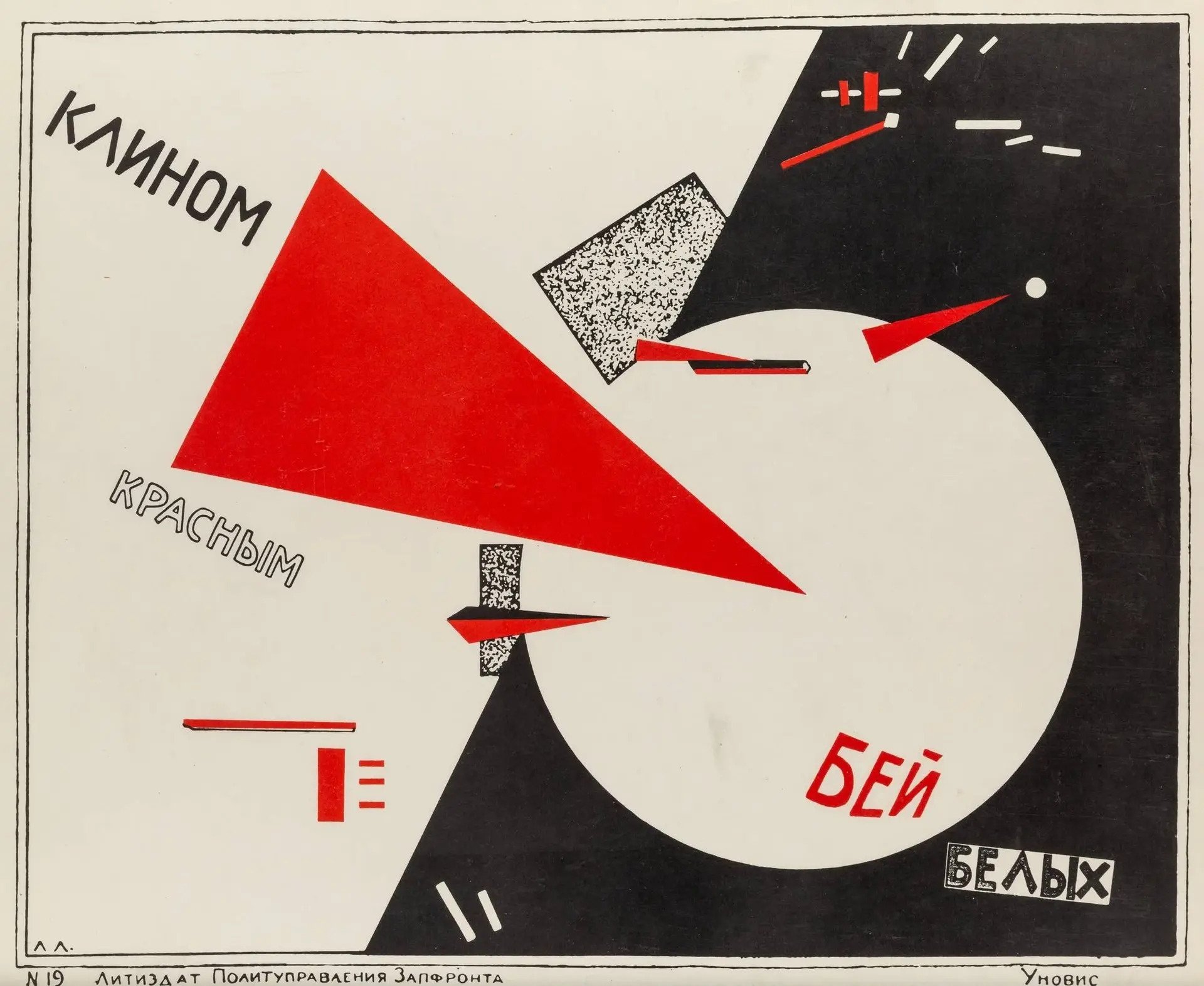
El Lissitzky, Beat the Whites with the Red Wedge, 1919. Public domain, via Wikimedia Commons.
The firm that signed itself Advertising-Constructor
In 1923 the poet Vladimir Mayakovsky and the artist Alexander Rodchenko started working as a team. They signed the results “Mayakovsky-Rodchenko Advertising-Constructor”, and between 1923 and 1925 Rodchenko turned out more than 150 advertising and packaging designs, by the count in the Museum of Modern Art’s account of his career. The clients were state concerns: Mosselprom, the Moscow food trust; GUM, the department store; Dobrolet, the airline; Rezinotrest, the rubber trust; the Red October confectionery works.
Mayakovsky wrote the copy. Rodchenko built the page around it, and the word “built” is the right one. Mosselprom’s line, “Nowhere else but at Mosselprom”, became so familiar that Moscow shoppers could finish it for you. In Rodchenko’s layouts a line like that sets the frame. The slogan runs in heavy block capitals along the edges or across the middle, bent into rules and bars, and the product sits in whatever space the words leave.
That’s the move you see in a modern display ad when the headline wraps the product shot, or when a single word set at 200 points becomes the border of the whole image. The slogan is the structure. Designers today call it type as image, or typographic layout, and teach it as if it were a style option. In 1924 it was a practical answer to a practical problem: cheap letterpress and litho shops, a limited set of colors, and an audience that had to get the message at walking pace.
The Rezinotrest galosh ads of about 1923 show the rest of the kit. Flat yellow ground, black silhouettes, a red exclamation mark, lettering set at several angles and sizes, and the trust’s name anchored at the bottom like a logo lock-up. Swap galoshes for running shoes and the bones of the page hold up. Hard diagonal, two or three flat colors, brand name in a fixed spot at the foot. Agencies would call that a brand system now.
A shouting face and a spinning city
The single image that travels furthest is Rodchenko’s 1924 poster for Lengiz, the Leningrad branch of the state publisher. Lilya Brik, photographed by Rodchenko, cups a hand to her mouth and shouts the word “Books”. The word comes out of her in a wedge of type, so the slogan literally becomes the sound, and the diagonal of her arm sets the angle for everything else on the sheet. Photo, type and geometry lock together in one gesture.
It reads instantly, which is why it keeps getting borrowed. The cover of Franz Ferdinand’s 2005 album You Could Have It So Much Better copies the shouting pose and the angled layout, an open nod to the Lengiz sheet, and the band leaned on Lissitzky’s red wedge for the artwork of their single “This Fire”. When a rock band in 2005 wants to look urgent, it reaches for a 1924 book ad. That tells you how little the vocabulary has aged.
Georgii and Vladimir Stenberg took the same tools into cinema. The brothers made their first film poster in 1923 and about 300 more before Georgii was killed in a motorcycle accident in 1933. Their poster for Dziga Vertov’s Man with a Movie Camera (1929, a lithograph about 110 by 71 centimeters, held by MoMA) splits a woman’s body into pieces, tips skyscrapers off the vertical and pulls the lettering into a vortex at the center. Most of it is drawn by hand, yet it looks photographic; the brothers drew with the cropping and close-ups of film. Look at any action-film key art where the title sits at the vanishing point and the city tilts toward it. Same trick.
Then there’s Gustav Klutsis, who pushed the photograph harder than anyone. He’s one of the handful of artists, along with Lissitzky, Hannah Höch and Raoul Hausmann, with a claim to having invented political photomontage around 1918. He and his wife Valentina Kulagina often posed for their own montages as shock workers and peasants, an early case of the designer as stock-photo model. In one of his election posters a huge hand, overlapped by a crowd of smaller photographed hands, rises along a black-and-white diagonal against a solid red field. One color, black and white photography, a hard angle. It’s the exact recipe of the duotone campaign that streaming services and sportswear brands run every season.
What the ad business kept and what it dropped
Lay the 1920s sheets next to a modern campaign deck and the borrowings are plain. The diagonal grid, where the layout is organized on a slant so the eye moves across the page instead of settling into it. Bold sans-serif type used as a picture, set huge, cropped by the edge of the frame. Photomontage: cut-out photographs dropped onto flat color with no attempt at a realistic scene. A single saturated color, usually red, against black and white. And the slogan as the skeleton of the page, so that removing the words would collapse the composition.
None of it was decoration; every choice answered a constraint. Flat color printed well on poor paper. Big type carried across a street. Photographs, still new on posters, read as proof. The diagonal made a static sheet look like it was moving, which mattered to a culture obsessed with speed, machines and the future. Contemporary designers face their own versions of those limits: a thumbnail the size of a postage stamp in a feed that moves at thumb speed, watched by someone who gives each tile less than a second (and often with the sound off). The answers came out the same because the problems rhyme.
What the ad business dropped is the edge. The Advertising-Constructor ads had a point of view; Mayakovsky’s copy pushed state goods as the modern, Soviet choice over the private trader, and Rodchenko’s pages looked like they were picking a fight. The Stenbergs’ film posters argued with the films they sold. Most modern ads borrow the look without the argument. The diagonal still moves and the red still shouts; the product just sits in the middle with nothing much to say.
The story ended badly for the people who invented it. By the mid-1930s Socialist Realism had pushed the avant-garde off the walls (the site’s earlier post on Soviet propaganda posters covers that turn), and Klutsis was shot by the NKVD in 1938. The layouts outlived them by a century. Through Lissitzky’s years in Germany and the teaching at the Bauhaus, the diagonal and the montage moved west, hardened into the Swiss grid, and came back out as the default language of selling things.
Next time a banner ad tilts its headline at 15 degrees and drops a cut-out product onto a red block, you’re looking at a Mosselprom biscuit ad with the biscuit swapped out.