Neon Reflections: Turning Poolside Light Into Abstract Poster Art
The water gets the biggest share of the picture, and rightly so. Across the lower half, yellow, cyan, red and hot pink stretch into long, wavering bands, interrupted by pools of black and deep teal. Above them, a palm tree stands almost solid black against walls that seem to have been built out of illuminated rectangles. There is still a place here, with a pool, rooflines and sculptural faces on a ledge. But the longer you look, the more the place gives way to the movement of color.
This abstract poster began with a photograph of a neon-lit interior. The source already contained the essential ingredients: strong colored panels, a dark palm near the center, pale geometric heads on the left and light breaking across reflective water. An AI-assisted reinterpretation pushed those relationships toward flat shapes, sharper edges and a screenprint-like surface. That distinction matters. The finished artwork is a new interpretation of the photograph, with details simplified and rearranged, rather than a record of the venue or a mechanically applied color-reduction filter.
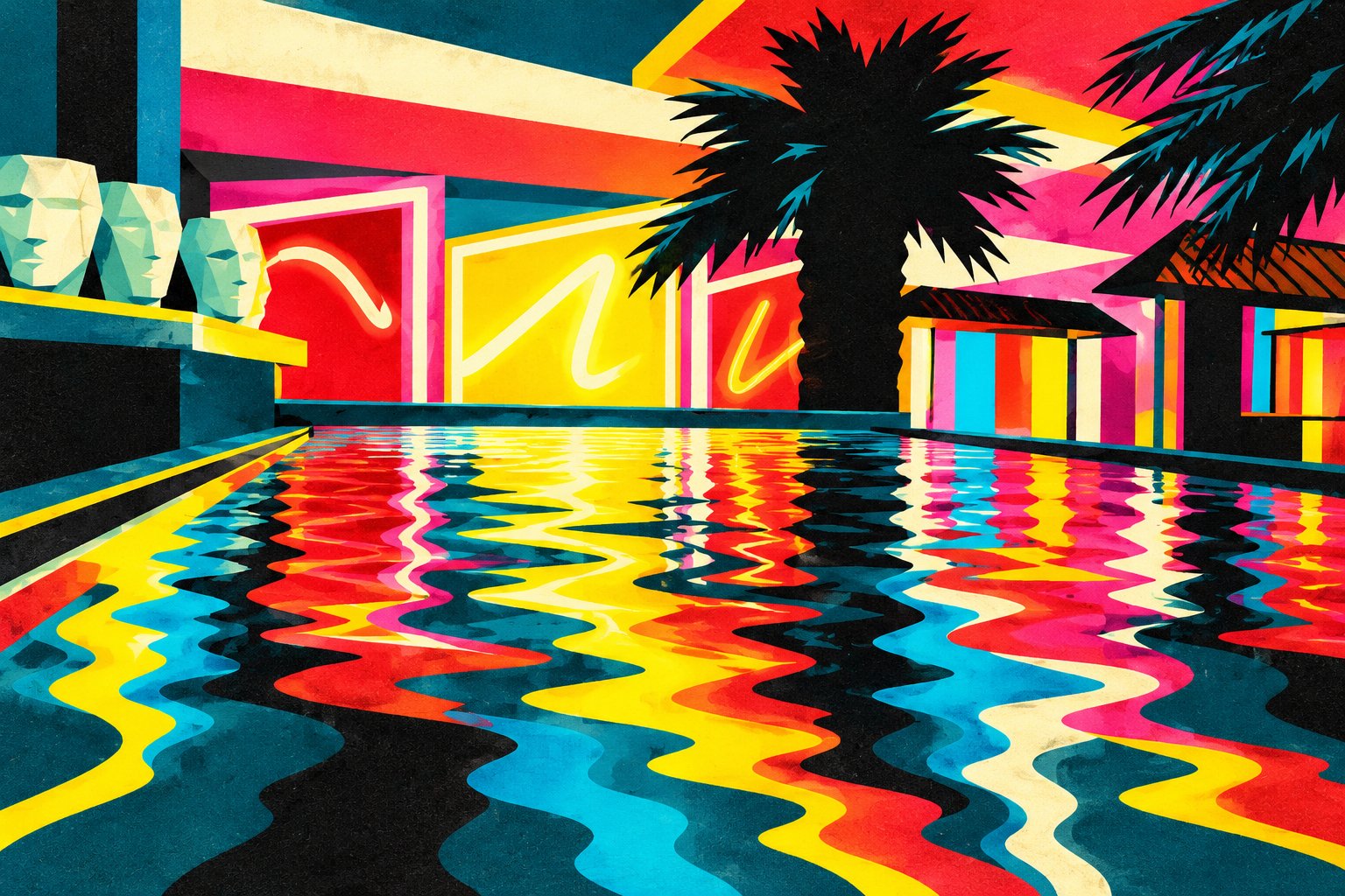
Image: Neon Reflections, an AI-assisted interpretation of an original photograph. Hosted by Pxef.com.
Start at the left edge. Three pale faces rise above a dark ledge, their cheeks and brows divided into angular cream, mint and turquoise planes. They provide a small pocket of stillness in a picture that otherwise refuses to settle down. Behind them, a red panel carries a loose cream-colored curve. A much larger yellow panel takes over toward the middle, bordered by light strips that tilt with the architecture. These gestures suggest neon writing without making a readable statement. You get the sensation of signage, the visual hum of somewhere open late, without a word demanding your attention.
The palm does a surprisingly practical job. Its thick trunk and jagged crown interrupt the bright panels and give the eye somewhere to land. Without that dark mass, the reds and yellows might spread into one continuous shout. Fronds entering from the upper right repeat its pointed shapes, while the small roof forms below them add another set of diagonals. The upper part of the picture is full of corners, wedges and straight boundaries. Beneath the pool edge, all that geometry begins to loosen.
Those reflections are where the transformation earns its keep. In the photograph, light glints and breaks into small irregular ripples. Here, the ripples become broad ribbons that widen toward the viewer. A yellow streak bends beside a red one; a cream band snakes through cyan; black channels open between them. Their edges never quite align. The result has a restless rhythm, as though the architecture above has melted and is slowly drifting toward the bottom of the page. It is a little excessive, which suits the subject. A restrained palette would lose the late-night electricity.
Posterization works best when simplification reveals a structure that was already worth seeing. Merely reducing a photograph to fewer tones can leave you with awkward patches around faces, muddy shadows and stray objects that suddenly look more prominent. This version takes a more selective approach. Incidental people and the arm crossing the original foreground have disappeared. The pool occupies a cleaner, more continuous space, and the surviving objects have clear roles: the faces establish scale, the palm anchors the composition, the walls supply color and the water carries it forward.
There is also a useful tension between the flat shapes and the suggestion of depth. The receding pool edges pull you into the scene, yet the hard color boundaries keep returning you to the surface of the image. You can read it as an interior, then as a collection of interlocking shapes, then as an interior again. Fine grain across the colors softens their digital precision and suggests ink on paper. It is a simulated print texture, of course; the image has not become a physical screenprint simply because it borrows that appearance.
On a wall, I would give this poster room. A slim black frame would connect with the palm silhouette and the dark channels in the water, while a pale surrounding wall would let the hotter colors remain distinct. It could work above a low cabinet, along a studio wall or in a room with metal furniture and a few strong color accents. My preference would be to avoid surrounding it with several equally busy prints. The reflections already supply plenty of company.
What makes the image worth returning to is the uneven division of attention. The palm catches you first, the yellow panel pulls you sideways, and then the water takes over. A photograph of colored light has become an arrangement with its own pace. You can still recognize the poolside scene, but its most ordinary physical event, light wobbling on water, now occupies the whole emotional foreground.